ThoughtExchange is a community driven feedback and survey tool. This software has a customer facing interface (Leader Experience) and a public facing interface (Participant Experience). This case study focuses on the Participant Experience for which I worked on the user research, wire-framing as well as the high fidelity prototypes.
1. Discovery
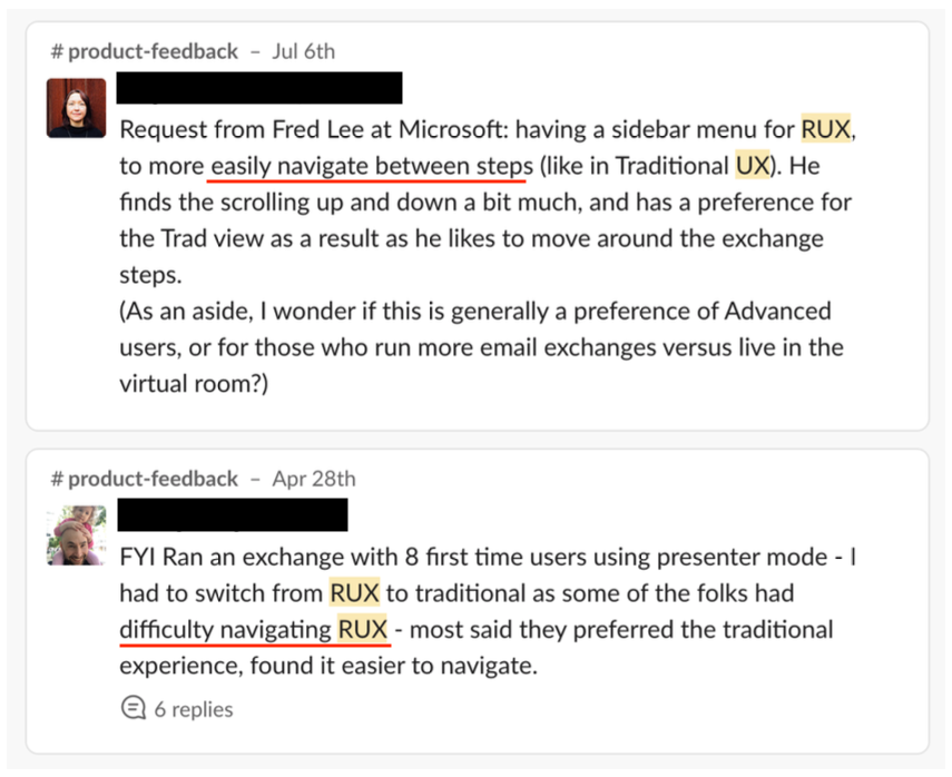
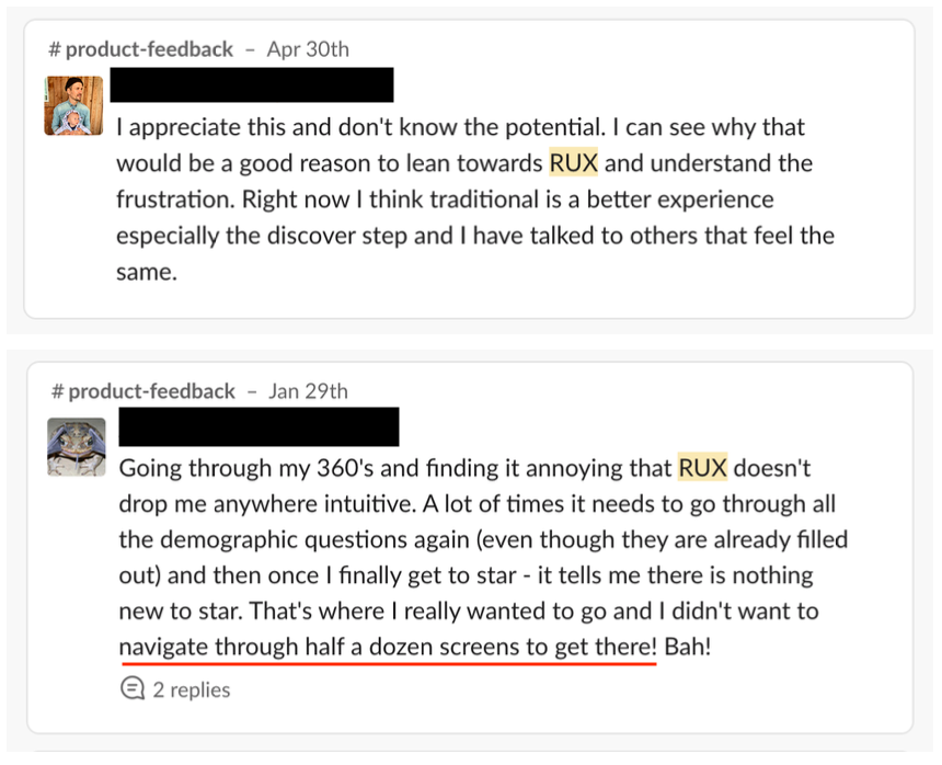
I started by digging into feedback we already had in Aha!, Gong and with the CSM team via Slack. There were two live versions of the Participant Experience; the 'traditional' experience and the newest which was knick named ‘RUX’.
I was able to find 3 main issues:
1. RUX brought the old one up to date but it had a lot of navigation issues and how to move around in the experience.
2. Participants weren’t really sure when they were done the survey and how they could return to view updates.
3. Skipping Thoughts - this feature was hardly ever used so I wondered if people knew it was there.


Next I moved to usability testing. I tested the current participant experience (RUX) with 5 different customers. Our customers are usually leaders (the people who set up the survey) so they don’t often participate. I wanted test the usability with them and also listen to the feedback they may have received. The goal of this test was to validate the assumptions
This video shows the user struggling with the navigation in the current versions of this experience
This video shows how the user is unclear on what to do when they don't know how to rate a thought and would like to skip a thought.
2. Finding a Solution
Before I started wire-framing I wanted to get a high level view of the user journey, the goals they are trying to achieve and the struggles they may encounter. I worked with a CSM to create a full Participant Journey map using Miro.
Below are the initial wire-frames for the first draft. (use left and right arrow keys to move through)
3. Validating The Solution
I tested the wire-frames with 5 brand new users who have never heard of ThoughtExchange before. The navigation seemed much better but there were a few things that came up and skip was still a problem. This is a screen shot from one test with the script to the right, we are discussing the ability to skip.
This screen shot is an example of when I tasked the user to go back into the exchange and rate more thoughts after they completed the exchange. All 5 participants were successful in this task.
This was a list of items I wanted to improve based on the results.
• They thought they were answering based on the survey question not the exchange
question. Because there are 2 questions displayed, this can be confusing.
• ‘Submit’ makes the user feel like it’s finished rather than moving to next thought. (Maybe instead, say 'Share another thought')
• Skipping thoughts is still not obvious
• Thought the progress bar was the total number of thoughts they need to complete rather than the goal set for how many they should complete (at a minimum).
Of course this site was responsive, these are a few of the mobile designs.