Vitruvi is a construction management software. They focus on broadband, telecom and utility infrastructure. The mobile users are on the field outside in the elements, have little to no time to onboard and for the most part do not speak the native language of the Vitruvi app (English, Spanish or German). This project focuses on a specific function of a 'Splicer'. (A line splice is a method of connecting electrical cables or optical fibers)
1. Discovery
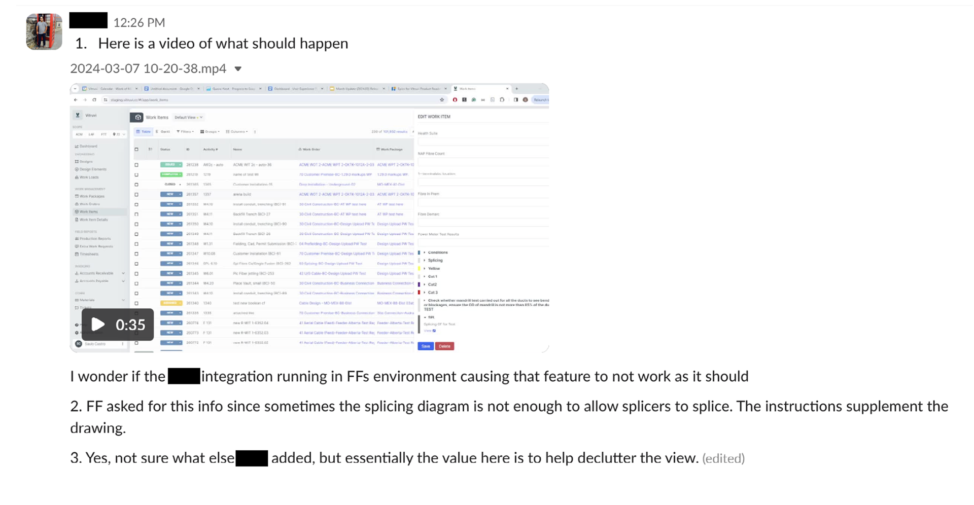
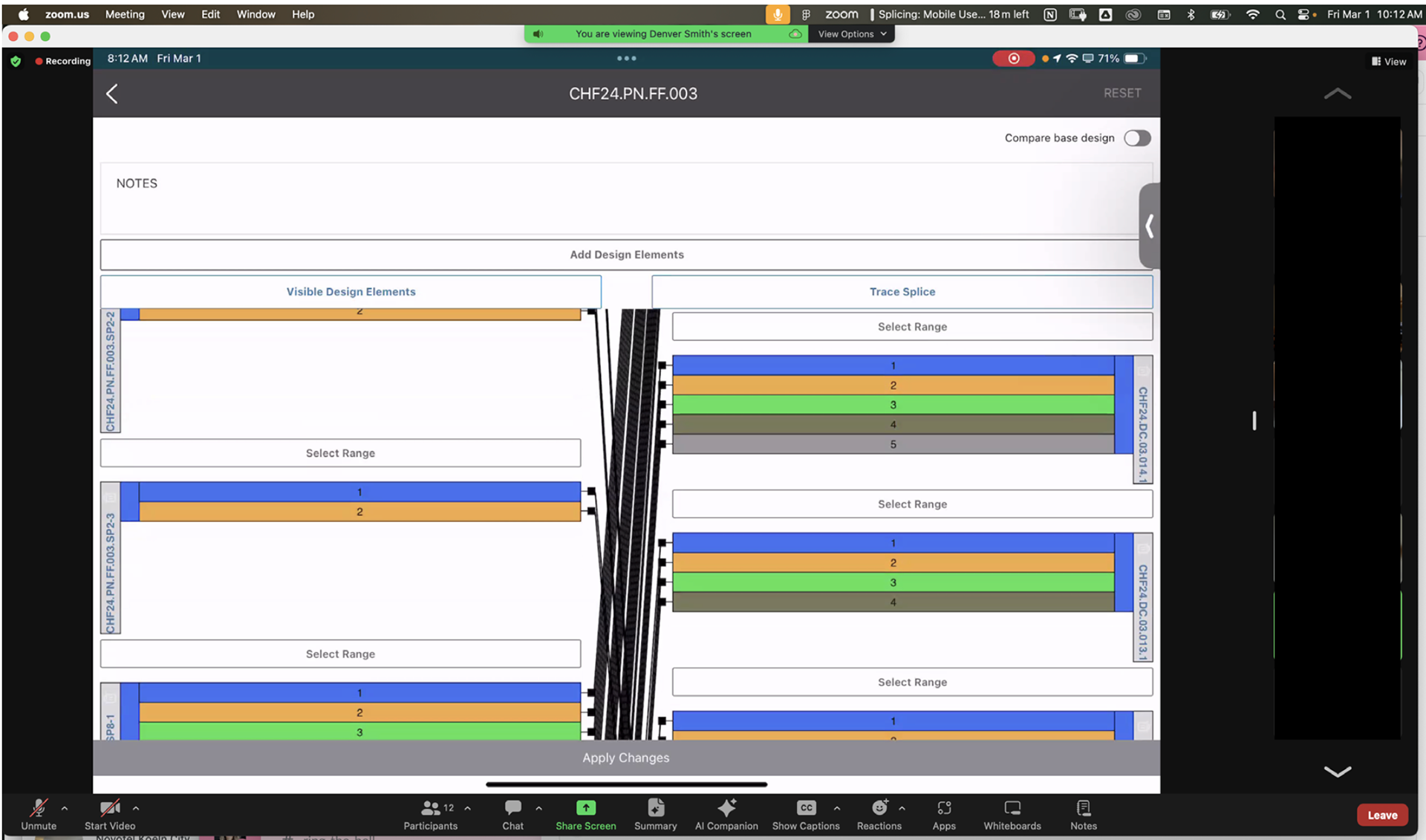
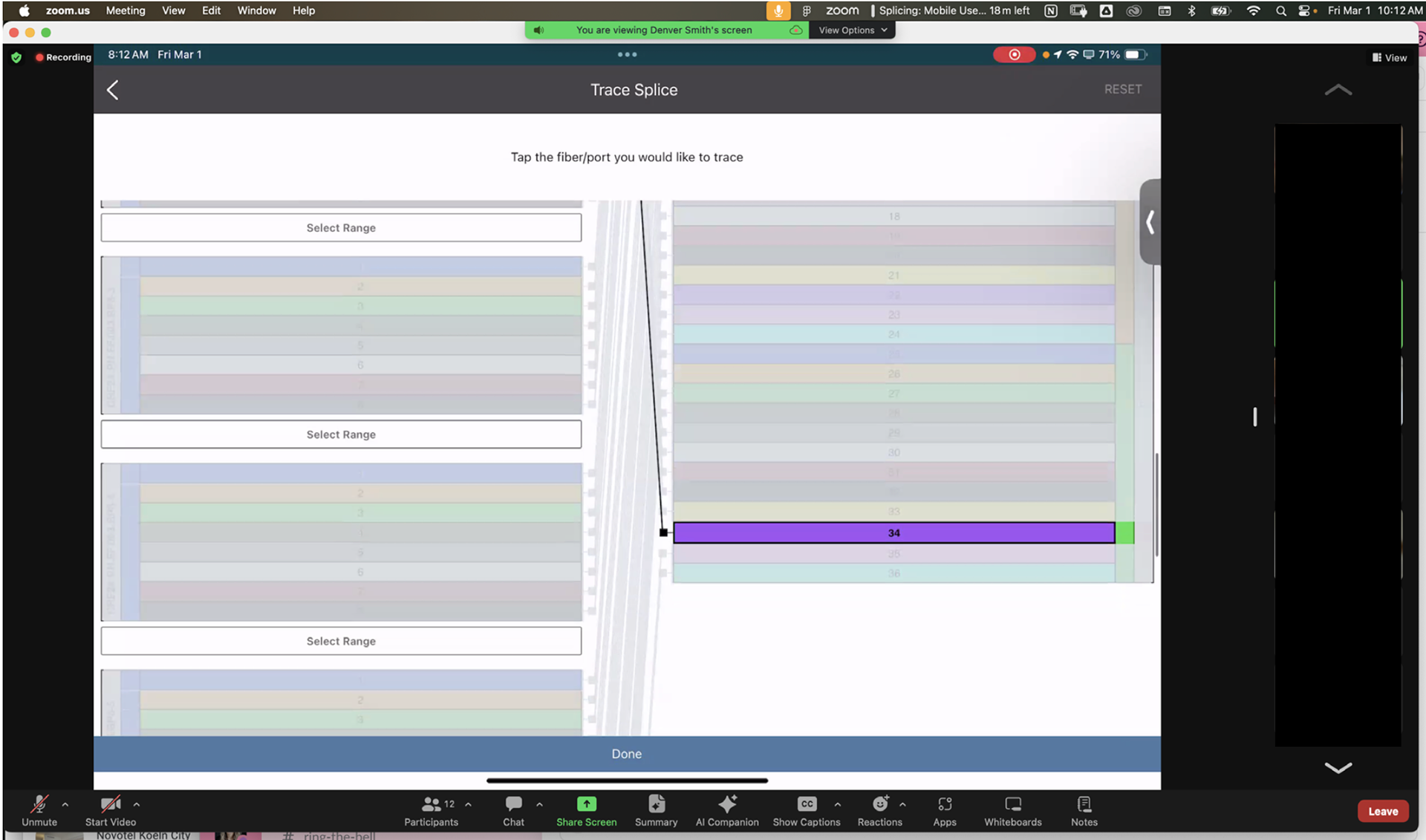
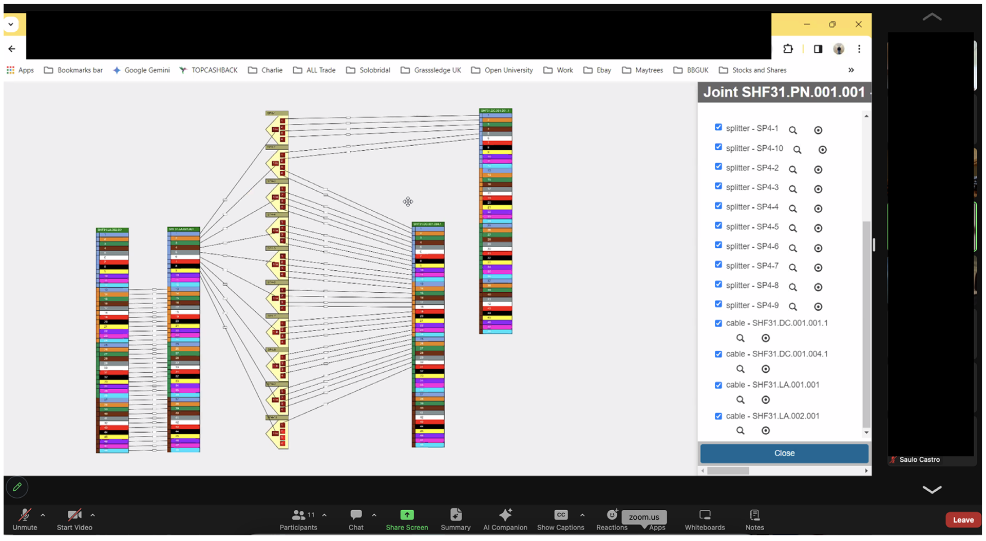
After putting out a rush feature without much UX input, we received feedback that it didn’t meet the customer’s needs and it was not user friendly. The first step was meeting with the users that were actually using this feature and figuring out more about their struggles. These are some screen shots from the customer meeting I took to note issues discussed.


What we found out was that the core use of Splicing was incorrect in the mobile app. In the mobile app the workflow priority favours editing but in real life their workflow is centred around 'Tracing'. (Tracing is when the user intends to see the ‘from‘ and ‘toʼ of the splice, basically highlighting a splice). Besides that, there were also a few usability issues.
These were the 3 'must haves':
These were the 3 'must haves':
1. Adjust the UI to accommodate the actual workflow
2. When they are looking at a splice, the ‘toʼ may be at the bottom of the screen. By the time they scroll down, they may have forgotten the ‘fromʼ splice.
3. There is no way to select multiple splices to ‘traceʼ a range.
To get into the ‘Trace’ mode, you would have to click ‘Trace Splice’ on the main screen. Having to click into this every time you came to this page didn’t make sense. Once the users traced the correct splice, they needed to obtain more detailed information regarding that splice. To do so they would have to click that small ‘i’ icon in the blue circle. Obviously only the first one is tappable since all the others are layered behind. This is an unacceptable user experience.
From a usability perspective there were lots of other small things that weren't very intuitive or up to the standard of the rest of the mobile app:
1. Organization and hierarchy of information and toggles
2. Inconsistent spacing
3. A lot of real estate for the ‘notesʼ section that doesn't seem to get used as much
4. Original goal when designing this flow was to edit the splices so by default when the user lands here, that is what the UI is geared towards (not tracing which seems to be the main goal now)
5. The ‘visible design elementsʼ button doesn't make a lot of sense to me.
2. Finding a Solution
In this first iteration I thought having 2 separate columns that scroll individually would help the issue of seeing the full path of the splice on one page. Unfortunately I learned quickly that this was not technically possible. This component was built in web and was controlled by web so there was only so much we could do with the code.
We settled on having the sections on the right swap instead. When you click on a splice from the left, whatever section it belongs to on the right will move to the top of the screen so you are able to see both at once.
The rest of the updates were possible, these are the main things I changed:
1. Trace/Edit mode in the header. By default the user will land in 'Trace Mode' which is their main workflow and also removes the risk of accidentally editing a diagram.
2. Swapping the 'i' icon for one button at the bottom. This will show all of the highlighted splices on one page.
3. The user will need to go into 'Select Range' mode in order to select multiple splices.
4. I also increased the height of the splice bars to make them easier to tap.
Below is a birds eye view of my ‘Brainstorming’ figma board. In the end I had 7 different variations of how I could achieve the same goal
I presented the final designs to the customer by demonstrating a clickable prototype. Normally I would prefer to test in order to get the best feedback but there was a very short timeline on this and we needed to make sure this met their needs before heading into development. The customer and their users were really excited about the updates.